top of page
'blink' magazine
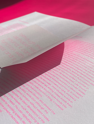
‘blink’ encapsulates the changing nature of the urban city and the uncanny experience of suddenly encountering new forms of living in an instant, reflecting the hasty desires of a progressive city, which consequently erases the impact of past urban objects, being replaced by the new. This specific magazine issue, ‘neon’, explores this viewpoint from the lens of neon signage, engaging with conversations of how the initial vibrant and dazzling typography used to grasp our attention has ironically blended into the very urban environment it was meant to stand out in. This accustom to over-exposure and over-usage of neon signage is a comment on the fast-paced nature of the Urban City and the need to continually advance in newer ‘cutting-edge’ technologies that the public has not seen, and thus are inclined to be more attracted to it.
This publication aims to engage with audiences of creatives, including artists, designers, and photographers, who have a keen interest in neon typography and/or signage.
Fully risographed in Fluro Pink and accessible editions available. Typographic style guide is included both digital and print forms.
𝜗ৎ printed outcome x typesetting
𝜗ৎ vector visuals x thermographic embossing x risograph
𝜗ৎ illustrator x indesign
𝜗ৎ 2025


bottom of page