top of page
Mirelle branding & packaging
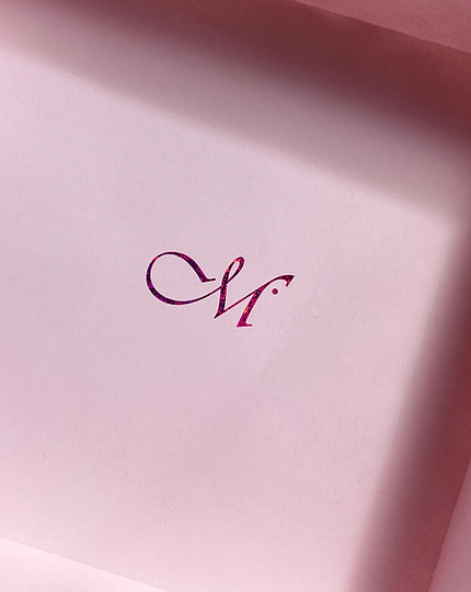
This project consists of a sustainable packaging design specifically intended to reflect a speculative brand, Mirelle Artisan Chocolate. The artefact utilises a minimal, yet elegant visual style, aimed towards a female audience - particularly women in their 20’s and 50’s. With the main feature being pink holographic foiling, a subtle, attractive appeal is garnered for its audience. Additionally, we have identified that Mirelle Artisan Chocolate is a popular choice of gift towards its female audience, indicating that individuals such as partners, family and friends are also a part of its target audience. As such, we have decided to draw on three famous flowers associated with gift-giving towards women: Lilies, Roses, and Tulips. These are also identified as key ingredients for this specific collaboration.
𝜗ৎ printed outcome x branding
𝜗ৎ vector visuals x diy foiling
𝜗ৎ illustrator x indesign
𝜗ৎ 2025


bottom of page